The Battle of Hong Kong 1941 is a highly user-involved database/interactive map that details an immense amount of information related to one of the first battles of the Pacific Conflict of World War II. Along with the fantastic interactive map, the site also includes the life stories of certain wartime combatants and civilians involved in the conflict. The site doesn’t just include stories however, it also provides users with pictures taken all across the wartorn area with descriptions. These pictures range from action shots of soldiers from both sides to highly detailed photographs of the weapons, equipment, and machinery used by the soldiers in the conflict. The site comes from the passion of those within the History Department of Hong Kong Baptist University.
The Interactive Map
In my opinion, the map is the most fascinating part of this website. It is able to convey so much information while remaining completely two-dimensional. I am deeply impressed that the map is able to be so descriptive in its 2-D form, but, the absence of a 3rd dimension can make the map often feel cluttered and hard to navigate. As a first-time user of the map, I was in a way intimidated by the sheer amount of information at my fingertips. However, this is more of a critique of the UX, than the UI, because once I buckled down and focused on one detail at a time, I was able to successfully navigate the wealth of knowledge provided. This is to say though, that if I wasn’t reviewing this website as a mandatory assigment, then I probably wouldn’t be very compelled to use it as a normal web passerby.
The map isn’t all bad though, as like I said above, with time, the map gets far easier to use and understand.
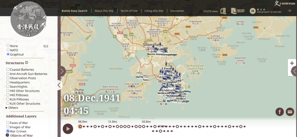
Along the left-hand side is a toolbar with checkable boxes that allow items to show or not show on the map. The first three options of None, NATO, and Graphical, show the locations of different military companies and their equipment like artillery. NATO and graphical both show the same amount of icons, but graphical just makes them more understandable for people who don’t understand the military iconography. (Hence why I have graphical enabled). Secondly, the structure box allows you to show the wartime setups of both sides, in my opinion, this is the least important part of the map, it provides more clutter than valuable information. Thirdly, the additional layers section is what I find to be the most helpful part of this map, as it links the map section with the database section of the map. It acts as a HUB of sorts, instead of having to go back to the main menu constantly, you can work from one area entirely. Included in the section are faces of war (pictures of those involved in the conflict), images of war (pictures of the wartorn battleground), and war crimes (descriptions of the many atrocities committed against the civillians involved in the war. Lastly, running along the bottom of the map, is the timeline selector, which allows users to move along the 18 days that the conflict took place, with moving icons representing both armies. https://digital.lib.hkbu.edu.hk/1941hkbattle/en/map.php
Overall, I find the map to be incredibly useful, as it is the focal point of the site, but in order to understand the importance of the map, one must be incredibely patient and willing to search.
The Haunting Beauty of the Site
While the map is indeed the main focus of the site, I was thoroughly entranced by the War Crimes and Faces of War section of the website. Often times when people find themselves researching wars of yesteryear, they leave their research without feeling much impact, because the people being researched died so long ago, that they almost feel fictional. This site however does not have that problem, as it provides people not only with first-hand accounts of the atrocities witnessed by civilians and soldiers, but also pictures of those people. This section really helps to take the website from strictly a database, and turns it into an ode to those who lost their lives in the conflict, by telling their stories, while still being a database for wartime information.
Take for example the Massace at St. Stephen’s College, a wartime field hospital containing both wounded soldiers and medical personnel. It is said that over 60 people were killed, with most all of them being wounded soldiers, and civilian nurses and doctors. Not only were the defenseless non-combatants killed in cold blood, but many of the nurses were raped by Japanese soldiers, only to be killed after the awful things being done to them, were over. Included in the description of this massacre, are the words of Stuart Begg, a man who survived the ordeal, “The rest of us were left in this room with a blanket darkening the window and left there without even a glass of water for the whole of that day. We were constantly molested, the wounded or otherwise taken out in pairs at regular half-hourly intervals throughout the day, to be shot in the corridor. …one of the first to go was Capt John Heckley of the Canadian Royal Service Corps and one of his sergeants. Next I heard the killing stopped when a Japanese officer entered at approximately 4.30 p.m. on December 25 and informed us that we were lucky we would not be shot because Hongkong had surrendered”. Begg, Stewart. (1941). St. Stephen’s College. Retrieved September 25, 2024, from Hong Kong Baptist University Library, History in Data: https://digital.lib.hkbu.edu.hk/1941hkbattle/en/data.php?show=item&id=WC00009.
As for the faces of war, I would like to highlight the death of Sergeant Jack Rich, born Ovaser Ricklovitch, on November 1st, 1907. His death took place on The 24th of December 1941, a day before the surrender of Hong Kong to the Japanese forces and the subsequent end of the war. Growing up in London, Jack had 7 siblings and started working for his father as a tailor at the age of 12 or 13, not much is known about his pre-war life. However, the scenario of his death is well-documented, as on December 24th, 1941, Sergeant Rich and his comrades were attacked by a Japanese barrage of grenades while trying to maintain control of a pillbox bunker. The men were overrun and mortally wounded, resulting in their deaths. Kwong, C.M. (2021). [Middlesex Regiment] Jack Rich. Retrieved September 25, 2024, from Hong Kong Baptist University Library, History in Data: https://digital.lib.hkbu.edu.hk/1941hkbattle/en/data.php?show=item&id=FW00001.
User Experience and User Interface
As you open the site, you are greeted by an index of all the different sections of the website, with a constantly running video of footage captured of The 1941 Battle of Hong Kong. This immediately helps to set the mood of the site, it’s all business, not once did I think that the site was trying to be comedic in any sense. Across the top are buttons that allow users to see the sites about page, terms of use, citation help, and a disclaimer to say that 100% accuracy is strived for but not guaranteed in the site. To the right of these buttons, users can access information about Hong Kong Baptist College, along with a running counter of how many times the site has been viewed. From these parts, it’s evident that this website is mainly focused on those seeking educational information, and on that level it delivers. From the front index, the site looks very easily accessible, everything is right there in front of you. This also goes for the search section, which allows users to peruse through all the pictures, descriptions, and firsthand accounts included in the database. I would go so far as to call this the meat of the site, as it is the backbone everything is built on. Just like above, this portion is incredibly straightforward and easily accessible from anywhere on the site. The problems with this site are mostly involved with the Interactive map (the potatoes of the meat and potatoes combo within this site). To reiterate what I said in the Map Section, the map is certainly impressive, with all the moving parts included in it, but those moving parts and their sheer volume are also the source of my biggest gripe. There is simply too much information given out right off the bat, and it’s without a doubt overwhelming for any user. The sidebar is a nice addition to allow users to toggle what they want to see on the map, but it’s executed poorly, as it also has too much information on it. Another pet peeve of mine about the map is the lack of scroll bars, you’ve just got to click around until something works, along with this, when trying to read descriptions on the map, the text is always overlapping with very similar fonts, that just seem to blend into each other. This user experience simply just made me want to avoid the map, but alas, I had to take a deep dive into it for the assignment.
Overall, if I were face to face with the creators of the website, I would congratulate them on their ambition and ability to compile information while also weaving a beautifully sad portrait of this short war, but the way in which these stories and information are experienced caused me to be taken out of the experience.
Star Rating: 3.5/5- A beautiful story that falls short due to the failures of its tellers.